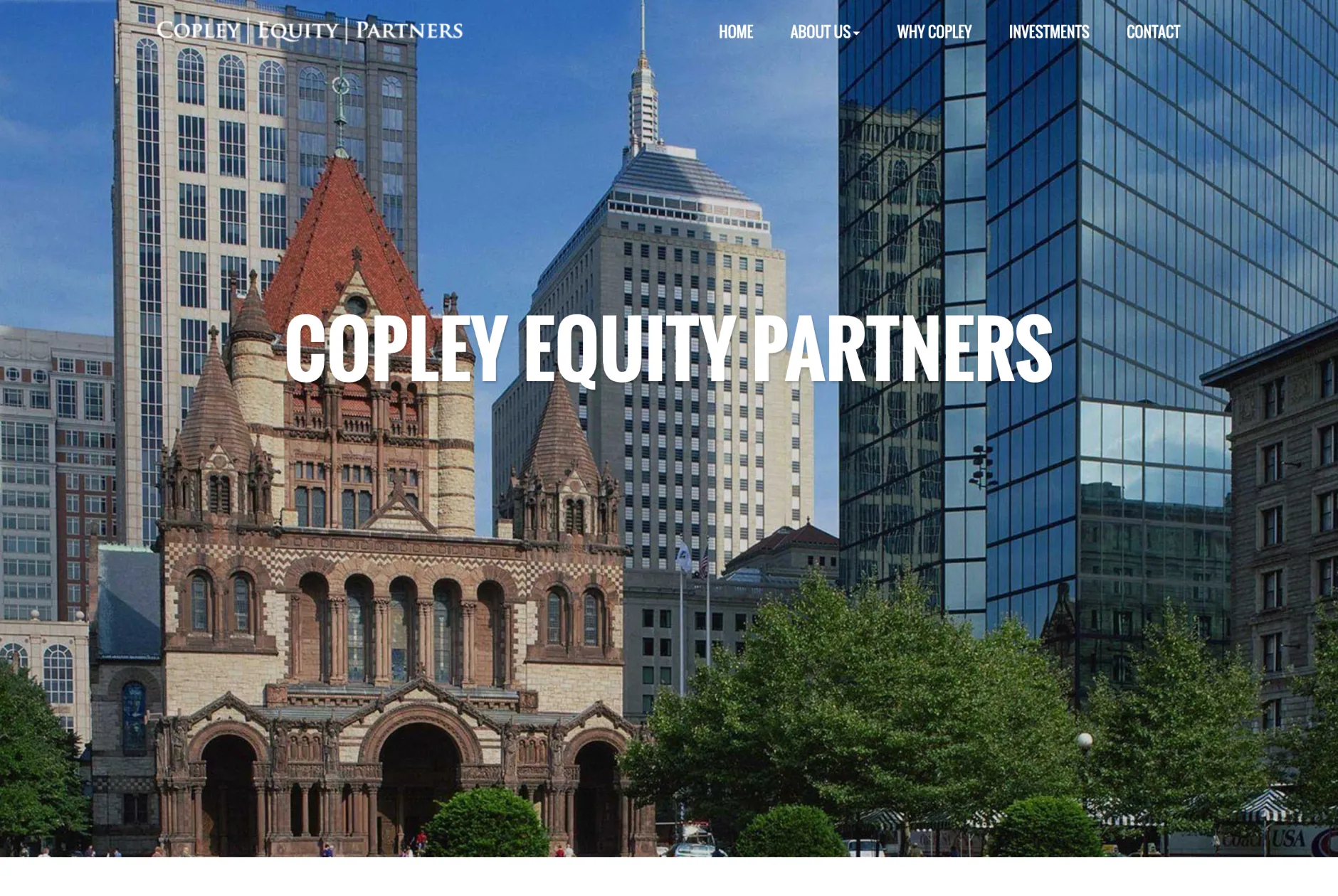
The Problem
Copley Equity Partners wanted a website and brand that matched the quality of their work. Their old site looked dated and didn’t clearly explain what they do or who they help. It was also difficult to update and didn’t reflect their professionalism or long-term investment approach.
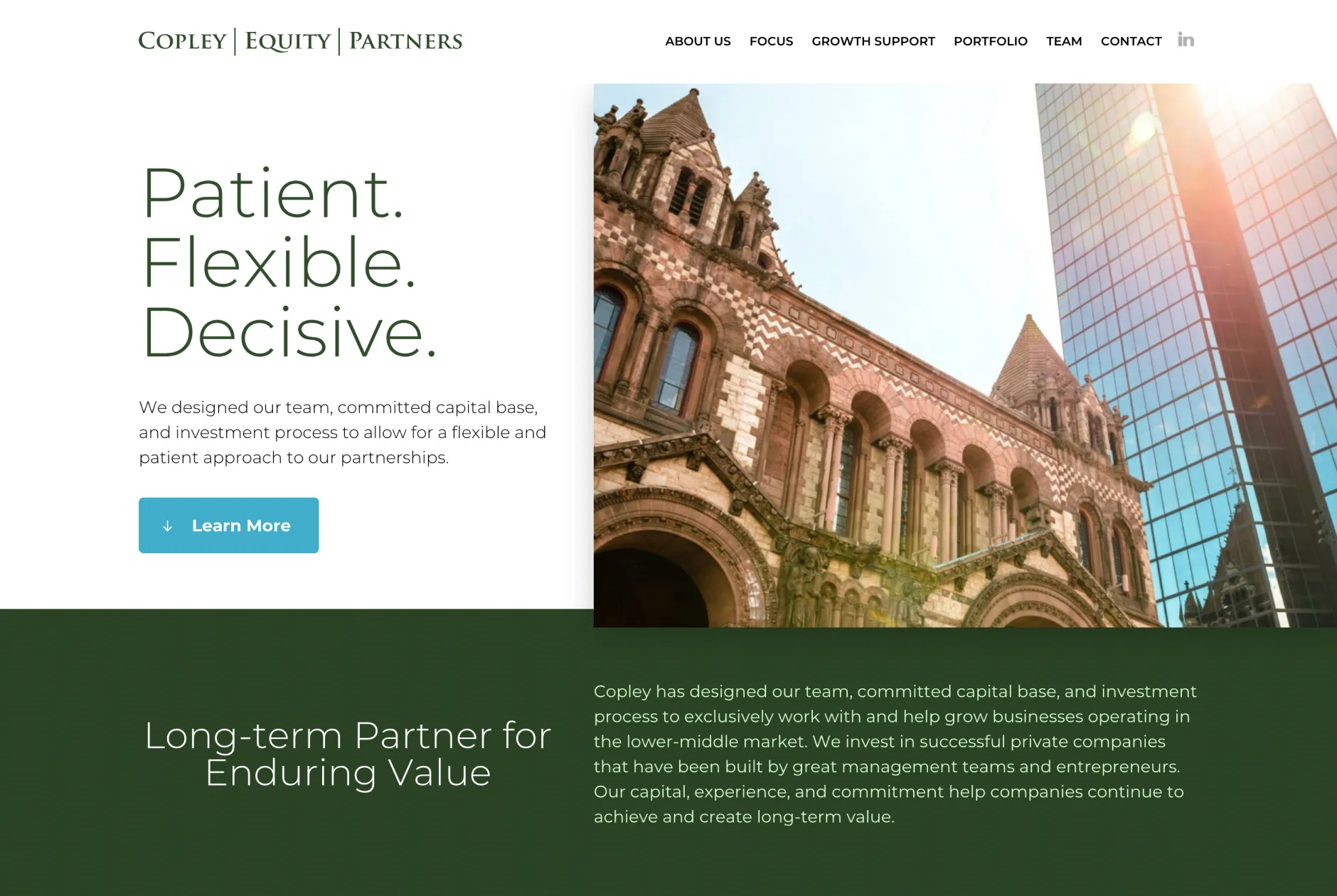
The Process
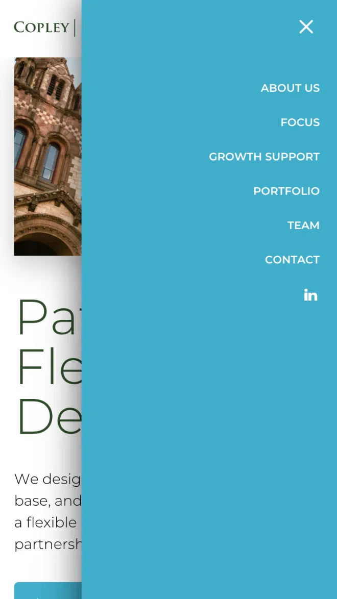
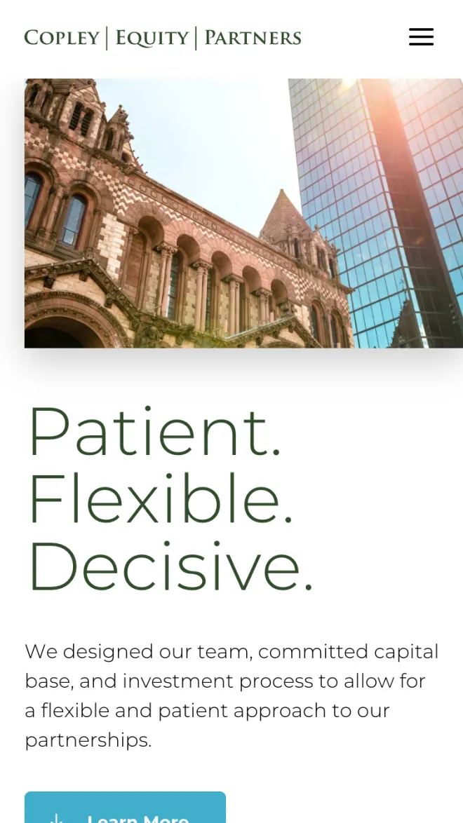
We redesigned their website from the ground up with a clean, modern layout and clearer messaging. The focus was on improving readability, simplifying navigation, and highlighting their portfolio, team, and investment strategy. We also improved performance, mobile responsiveness, and backend editing so their team could easily manage updates.
The Result
The new site feels more polished and trustworthy, giving Copley a stronger first impression with investors and founders. It loads faster, works well on all devices, and better communicates what makes them different—helping them stand out in the competitive private equity space.